
Too often, we celebrate aesthetics without paying for substance. We want culture, but not the creators behind it. We want originality, as long as it is cheap and does not come with licensing fees. Here is the harsh reality: without real rewards, financial, professional, institutional, for our best creative artists, the industry will go dark.
Talented illustrators will lose out. Studios will give up. The next generation will not bother. No one becomes an artist to chase suits. Most just want credit, fair pay and to not be gaslit by an industry that cherry-picks their style, copies, not pays for the time required and curated selections that comes with experience, as well as creative integrity, that goes into a process of crafting coherent, appealing products or campaigns, while all this while, pretending this is not a specific skillset that exists.
Yet, somehow, this keeps happening — again and again — in Singapore’s creative scene.
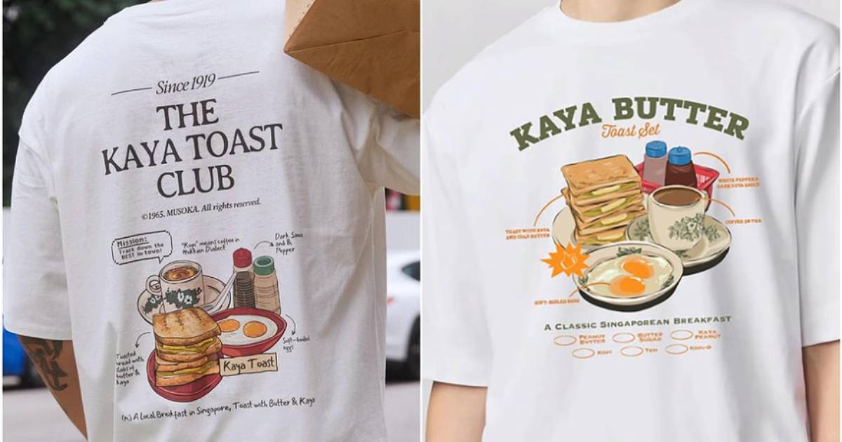
Last week, Uniqlo Singapore dropped a food-themed T-shirt collection for its UTme! Local Delights Collection, launched as part of its Thank You Festival, with all the makings of a crowd-pleaser: nostalgia, hawker culture, a whiff of “local pride”. Though, the buzz quickly turned sour when eagle-eyed fans pointed out that the designs looked eerily similar to indie brand Musoka Club’s existing collection from July 2023, known for its tongue-in-cheek food tees, launched its “Dress Code: Kopitiam Series”, as highlighted by Amanda Chai.
Like Uniqlo’s new drop, it features stylised illustrations of the same dishes, kaya toast, chilli crab, laksa, chicken rice, and bak kut teh — even down to the centralised food graphics, ingredient callouts and retro font, typography vibes. It certainly was not a collaboration. It just looked like one. Founder of Musoka Club, Ms Elaine (who prefers to go by her first name), has been diplomatic in her approach. She is not accusing Uniqlo of copying outright, as can she claim to hold space over hawker culture in general, but she is asking a valid question, when do shared cultural motifs stop being fair game and start looking like lazy creative lifting.
She continues to say that the parallels are “too similar to stay silent”. Adding fuel to the fire? One of Uniqlo’s featured artists, referenced Musoka Club on Instagram. The situation has led to widespread online chatter, with commenters calling for artistic credit and fair creative play.
Meanwhile, over at 7-Eleven, their Hawker Fiesta campaign got quietly scrubbed off social media after creative studio 8EyedSpud called them out for using an art style nearly identical to the UNESCO Singapore Hawker Culture campaign — a project they themselves had worked on. The agency responsible, LH.M Advertising, blamed an external illustrator who admitted to “taking reference”. Let’s be honest: the line between “inspiration” and “imitation” is looking mighty thin these days.
As 8EyedSpud aptly put it: “If you have a direction in mind, get them to explore a theme from their own point of view. Don’t force a style and mandate you saw elsewhere. Don’t water down your brand with thoughtless imitation.” And don’t ask an artist to draw like someone else just because that style worked for a different campaign. Hire them to draw like themselves — that’s the point. In that instance, it was a swift takedown, but could it have been avoided in the first place, and on retrospect, what are the fees involved and time wasted, in not fairly attributing, nor accounting for licensing amounts to begin with.

The Real Cost of “Reference”
We have reached a point where referencing is becoming a shield — a way to deflect responsibility while quietly cashing in on the aesthetic groundwork laid by original creators.
Whether it’s a local content agency revamping a dated title like The A List for a client like CATCH, with its distinct red and green colour palette, over a muted black and white photography collage in 2014, only to echo the vibrant visual identity of a leading media brand in the present — down to the distinctive colour palette, comprising of the use of dark blue background blocks, with image overlays, spliced with specifically coloured highlights and the precise selection to string it together, and stylised use of fonts — the result is the same: substance gets erased.
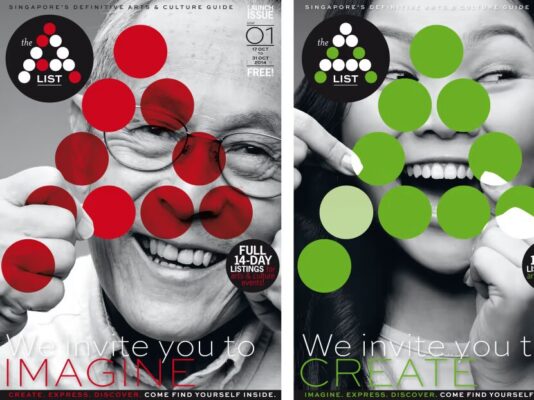
It could be purely coincidental, or it could be that the young agency, having previously pitched to a veteran prior for unrelated brands, then goes into separate pitches for those not used to the standards of quality of pitches, held by such brands, to a new client like The A List, found itself in a dual role, of content development and press pitching, that ought to be disclosed. This had resulted in uncanny similarities in look and feel. Take, for example, the 2024 web layout featuring full dark blue blocks alternating with white space on scroll, with fuchisia pink, violet and turquoise highlights, a design element seen in both.
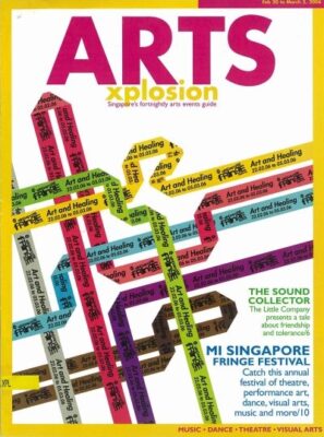
Ten years ago, The A List’s mission was to deliver arts stories that were “snappy” and “hassle-free,” appealing to time-pressed readers. Mr Michael Chiang, popular local playwright and print veteran, with multiple titles under his belt, viewed serious arts discussions as potentially “deadly dull,” so design became the tool to energise the pages, making culture feel lighter, slicker, more palatable, and far “less intimidating.” Supported by the National Arts Council and as the then editorial lead, this approach aimed to position The A List as a more attractive alternative to the 2006 arts events guide, Arts Xplosion, without descending into lowbrow “showbiz gossip,” yet still holding credibility and authenticity.
The unnamed media brand that The A List has closely mirrored has held that authentic vision for more than a decade, building a distinct identity through its standards of excellence, expounded in its stellar curation of media, news articles and design. So, when today’s look and vibe of The A List closely resemble this established brand’s aesthetic, as referenced below, with the gaps of finesse and soul, we must ask: how much of that energy is truly built, and how much is simply borrowed?
The leap in colour logic from The A List, in 2014 to CATCH, now, is a mystery and would normally require extensive creative research, prototyping and iteration. Yet, the striking similarities suggest some copy the output, without investing in the input.

And when the originator addresses such actions gently, without resorting to personal attacks? An uneasy pill to swallow, leaving the crux of thoughtless copying, unaddressed. In a culture where recognition and reach are currency, some that try to exert other means, simply try to game it differently to continue the mimicry.
What Needs to Change
For illustrators: Ask better questions. Push back on those who demand mimicry.
For consumers: Look beyond the price tag. Sometimes that $59 indie tee is not overpriced, as much as you can get the same for half the price by price checking, or back searching similar images on an e-commerce websites, it is valuing originality and culture-making, that the creator spent time to make it. Not just cotton and ink.
For agencies and clients: To develop a distinct style, pay the person who can create or curate it.
Respect Can’t Be Retroactive
Here’s a radical idea: what if big brands respected originality before someone gets called out? What if credit, whether in attribution or in payment, was not something creatives had to make multiple requests for, resort to multiple escalation points when it is ignored, but something automatically offered and so are fair licensing discussions.
What if marketing teams, agencies, and clients, who proudly declare “we love local” every National Day Parade — actually took the time not to commercial exploit local creators from having their work diluted, duplicated or disrespected. Culture thrives when its makers are protected. And in a cosmopolitan city constantly struggling to define what creativity means here, the very least we can do is not let artistic thievery wear the mask of tribute.
This is not about gatekeeping culture. Singapore’s food heritage, our visual motifs, our nostalgic design language — these belong to all of us. So the next time a big-name campaign rolls out with a suspiciously familiar vibe, ask: is it truly a celebration of local culture, or just a corporate remix of someone else’s sweat? Because Singapore does not need more borrowed visuals. It needs brave, original voices. And they are already here, if we would just stop stealing from them long enough, or commercially exploiting them further to furnish payment when due.
Image credit: Uniqlo, Musoka Club, Tiled by AsiaOne / Straits Times
Stay updated and social with Popspoken: LinkedIn | Instagram